





Article
Reducing energy usage in senior living
Explore practical ways senior living facilities can reduce energy usage, control operating costs, and improve efficiency across their buildings.
Senior living and care facilities are energy-intensive buildings with continuous operating needs, from resident comfort and safety to heating, cooling, kitchens, laundry, and care-related equipment.
That energy intensity also creates a meaningful savings opportunity. Retrocommissioning programs report potential energy bill savings of up to 15% per year, often with paybacks of less than two years, which makes it important for operators to know which facilities are worth investigating first.
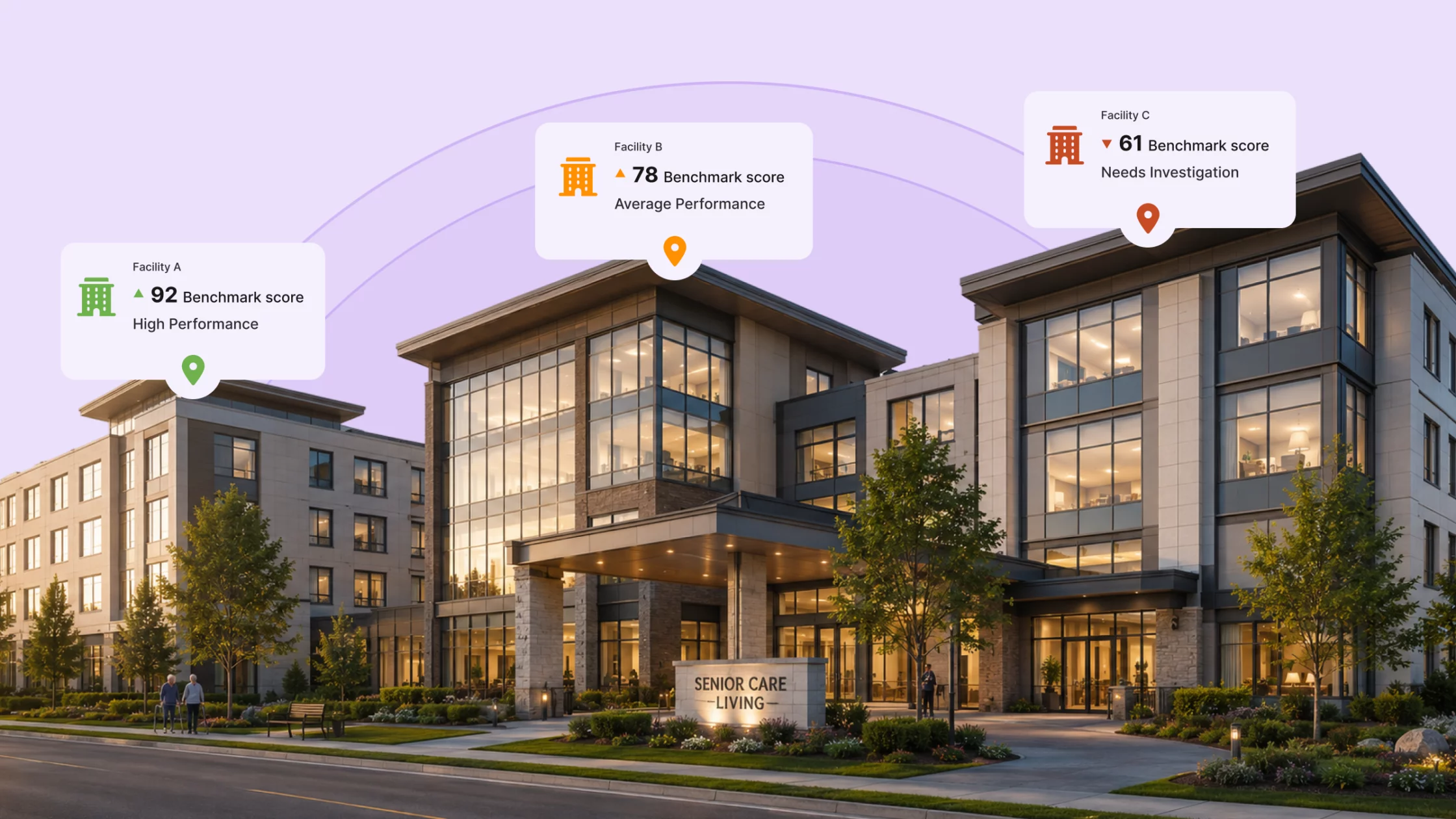
For multi-site operators, the challenge is turning scattered utility, finance, and contract data into a portfolio view that enables comparison of facility performance and identifies energy-saving opportunities.
This senior living energy usage breakdown whitepaper outlines a practical way to compare energy usage across senior living portfolios. It shows how to:
The goal is to move from fragmented energy data to confident portfolio decisions across budgeting, operations, procurement, capital planning, and emissions reporting.
Energy usage in senior living facilities is higher than in many common commercial building types. That creates a real savings opportunity, but only if operators can see which facilities are driving usage, cost, and emissions across the portfolio.
Senior care facilities have higher median energy use than many common building types
Senior care facilities: 1.2 GJ/m2 Offices: 1.1 GJ/m2 Retail: 0.9 GJ/m2 Schools: 0.9 GJ/m2
NRCan’s 2022 snapshot included 600 benchmarked senior care buildings covering 6.25 million m². Only 10 of those buildings were ENERGY STAR certified, which suggests there is still a significant opportunity for senior care organizations to capture energy savings.
Comparing senior care facilities can be complex because care portfolios can include a mix of long-term care homes, assisted living residences, independent living buildings, memory care wings, mixed-use campuses, and older buildings that have been expanded over time.
Facility-level differences also matter. Some sites have full-service kitchens and laundry. Others outsource laundry, use different HVAC systems, have more licensed beds, or share a central plant across multiple buildings.
Because of those differences, the highest-cost facility is not always the least efficient facility. A fair comparison needs more context than total cost or total usage.
Energy data is often spread across utility bills, supplier portals, meter data, finance systems, procurement files, building systems, capital planning spreadsheets, and emissions reports. Each team may organize it differently, which can make the data appear complete yet still be difficult to use for fair comparison.
Senior care operators need a clearer way to answer practical questions:
When energy data is not standardized across a senior care portfolio, teams may focus on the wrong sites or misread the cause of cost changes.
Here are five signs energy data may be leading teams to the wrong conclusions.
The same facility can look like a top problem in one report and normal in another. One report may rank facilities by total annual energy spend, another may rank by electricity cost only. A third may rank by combined electricity and gas usage, and a fourth may rank by emissions.
Unless the same calculation rules are applied, the ranking does not show which sites are truly driving cost, usage, or emissions.
A 230-bed mixed-use campus will usually consume more total energy than a 90-bed care home. That does not mean it is performing worse.
Without facility context, teams may focus on the biggest buildings while missing smaller sites with higher energy intensity, higher cost per bed, or unusual year-over-year changes.
When energy data is organized differently by each team, the numbers may not line up across reports. Finance may track billed cost by invoice date, while operations tracks consumption by meter read or service period.
Each number can be accurate within its own system, but still difficult to reconcile.
A higher energy bill can be caused by higher usage. But it can also be caused by commodity prices, delivery charges, demand charges, taxes, carbon-related charges, rate class changes, contract timing, or billing adjustments.
Treating every cost increase as an operational problem can lead to unnecessary audits or retrofits. Cost and consumption need to be reviewed separately.
Emissions reporting becomes difficult when fuel types, units, reporting periods, and provincial emissions factors are handled differently across the portfolio.
If teams are manually correcting spreadsheets each reporting cycle, the issue is usually the underlying data structure.
Raw totals are figures such as total annual energy cost, total electricity use, total natural gas use, or total emissions. They are easy to report, but they can give operators the wrong first impression.
In senior care, raw totals are shaped by facility size, licensed beds, occupancy, care model, kitchens, laundry, HVAC systems, weather, rates, and contract terms. That means the highest-cost facility is not always the least efficient facility.
Raw totals are still useful. They show where the largest costs sit. But they should be treated as a starting point, not a final ranking of which facilities are underperforming.
Raw totals can point to the wrong facility
Quick example: A mixed-use senior campus spends $600,000 on energy each year, while a smaller long-term care home spends $440,000. On raw totals alone, the campus looks like the bigger issue. But if it is much larger and has more licensed beds, total spend is not enough to decide where to investigate first.
The smaller home may still have higher energy use per square metre, a higher cost per bed, or a steeper increase against its own baseline.
A comparable baseline is a standardized portfolio dataset that allows facilities to be measured consistently across sites and over time.
For senior care portfolios, the baseline should include 12 to 24 months of data across every facility, account, meter, and fuel type. The goal is to connect utility data with facility context so operators can compare sites fairly and explain what drives costs, usage, and emissions.
A useful baseline should include:
A clean baseline gives teams a common starting point before they rank sites, investigate outliers, or make decisions about procurement, operations, capital planning, or emissions reporting.
Senior care energy visibility needs both electricity and gas
In NRCan’s benchmarked senior living data, natural gas accounts for 55% of total energy use, while electricity accounts for 41%. Smaller sources make up the rest.
For senior care operators, this means energy visibility needs to include both major fuel types. Looking at only one side can miss energy use, cost exposure, and emissions overall.
The table below is illustrative and uses the same facilities from the raw totals example. The purpose is to show how raw portfolio data becomes easier to compare when it is consistently structured.
| Prairie Senior Campus
ALBERTA SCF-001 |
Lakeside Long-Term Care
ONTARIO SCF-002 |
Riverbend Long-Term Care
ONTARIO SCF-003 |
Maple Assisted Living
BRITISH COLUMBIA SCF-004 |
|
| FACILITY INFO | ||||
| Address | 101 Centre Ave. | 220 Lakeview Rd. | 55 Riverbend Dr. | 88 Maple Way |
| Care model | Mixed-use campus | Long-term care | Long-term care | Assisted living |
| Floor area | 20,000 m² | 14,000 m² | 12,000 m² | 13,000 m² |
| Licensed beds | 230 | 160 | 130 | 150 |
| Kitchen / laundry | Full kitchen and laundry | Full kitchen and laundry | Full kitchen and laundry | Central kitchen, outsourced laundry |
| Reporting period | 2025 annual | 2025 annual | 2025 annual | 2025 annual |
| ENERGY USE | ||||
| Electricity use | 2,850,000 kWh | 2,070,000 kWh | 1,980,000 kWh | 1,630,000 kWh |
| Natural gas use | 14,740 GJ | 10,748 GJ | 10,272 GJ | 8,432 GJ |
| Site EUI | 1.25 GJ/m² | 1.30 GJ/m² | 1.45 GJ/m² | 1.10 GJ/m² |
| Weather normalized | Yes | Yes | Yes | Yes |
| COSTS | ||||
| Annual energy spend | $600,000 | $480,000 | $440,000 | $390,000 |
| Energy cost | $30.00/m² | $34.29/m² | $36.67/m² | $30.00/m² |
| Commodity charges | $255,000 | $198,000 | $176,000 | $165,000 |
| Delivery / fixed / regulatory charges | $345,000 | $282,000 | $264,000 | $225,000 |
| EMISSIONS | ||||
| Emissions | 842 tCO₂e | 622 tCO₂e | 594 tCO₂e | 432 tCO₂e |
| Emissions intensity | 42.1 kgCO₂e/m² | 44.4 kgCO₂e/m² | 49.5 kgCO₂e/m² | 33.2 kgCO₂e/m² |
| Electricity emissions factor | Province-specific | Province-specific | Province-specific | Province-specific |
| Natural gas emissions factor | Fuel-specific | Fuel-specific | Fuel-specific | Fuel-specific |
Once built, the baseline should help teams answer practical questions:
Once a comparable baseline is in place, facilities can be assessed more fairly. The examples below show two ways to compare performance: against similar facilities, and against a facility’s own normalized historical baseline.
Consider three facilities from the baseline:
| Facility | Care model | Province | Floor area | Licensed beds | Annual energy spend | Site EUI |
| Lakeside Long-Term Care | Long-term care | ON | 14,000 m² | 160 | $480,000 | 1.30 GJ/m² |
| Riverbend Long-Term Care | Long-term care | ON | 12,000 m² | 130 | $440,000 | 1.45 GJ/m² |
| Prairie Senior Campus | Mixed-use campus | AB | 20,000 m² | 230 | $600,000 | 1.25 GJ/m² |
Prairie has the highest total spend, but it should not be compared directly with Lakeside and Riverbend. It is larger, located in a different province, and operates as a mixed-use campus.
Lakeside and Riverbend are a fairer comparison. They are both Ontario long-term care homes with similar operating requirements. In terms of total spend, Lakeside looks like the larger issue. But when energy use is compared per square metre, Riverbend has the higher EUI and becomes the stronger candidate for investigation.
A facility can also look stable year over year while still using more energy than expected.
Consider Lakeside Long-Term Care over two years:
| Year | Floor area | Actual energy use | Expected energy use after normalization |
| 2024 | 14,000 m² | 18,000 GJ | 18,000 GJ |
| 2025 | 14,000 m² | 18,200 GJ | 17,200 GJ |
At first glance, the increase looks small: 200 GJ, or about 1.1% year over year.
But after normalizing for milder weather and similar occupancy, the facility’s expected energy use should have fallen to 17,200 GJ. Instead, it came in at 18,200 GJ. That means the facility used 1,000 GJ more than expected.
The raw year-over-year change looks minor. Compared with its own normalized baseline, the facility is moving in the wrong direction and should be reviewed.
Before launching an audit or retrofit, operators should separate cost from consumption. A facility with flat usage and rising cost may not have an equipment problem. Instead, the increase may come from a tariff change, contract renewal, delivery charge, carbon charge, or billing issue.
A facility with rising usage and stable cost may still have an operational problem. The total bill may appear unchanged because lower rates or other cost factors mask the increase in energy use.
A long-term care home in Ontario shows the following year-over-year change:
| Year | Total energy use | Total energy cost |
| 2024 | 17,000 GJ | $470,000 |
| 2025 | 16,950 GJ | $535,000 |
The bill rose by $65,000, or about 14%, while usage stayed essentially flat.
This is likely not an equipment problem. It is more likely a unit-cost, rate, contract, tariff, tax, or billing issue. Procurement and finance should review the account before operations schedules a retrofit study.
| Potential Cost Driver | What it may indicate | Likely owner |
| Higher normalized usage | Operational, equipment, controls, or maintenance issue | Facilities / operations |
| Higher commodity price | Market-driven increase | Procurement / finance |
| Higher demand charges | Peak load or load profile issue | Facilities / procurement |
| Higher delivery or fixed charges | Utility rate or billing change | Finance / utility review |
| Carbon-related charges | Policy-driven cost increase | Finance / sustainability |
| Contract renewal timing | Procurement exposure | Procurement / finance |
| Billing adjustment or meter issue | Account or data problem | Finance / utility review |
After cost, usage, billing, and contract drivers are separated, operators can build a more useful investigation shortlist. The goal is to focus attention where the data shows the greatest potential issues or opportunities.
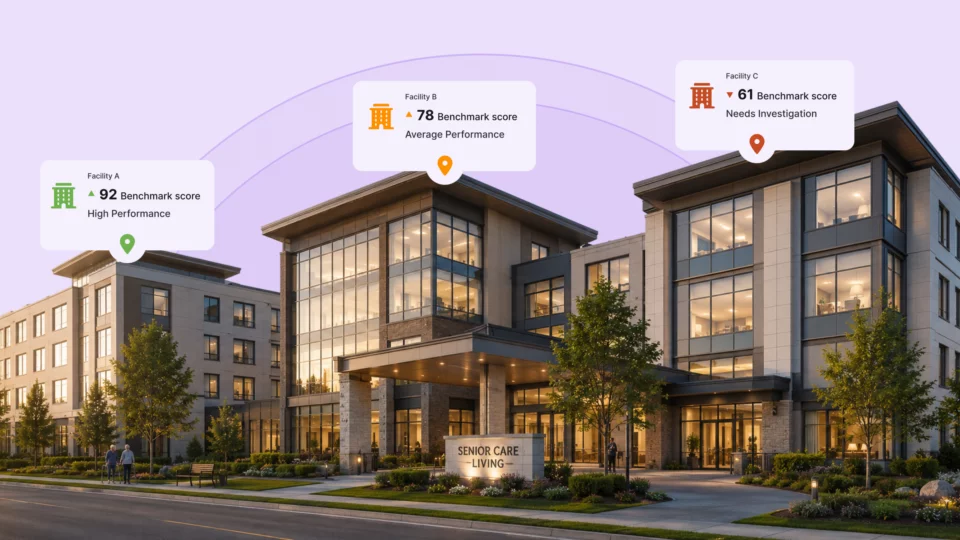
A practical starting point is to flag the worst-performing 10% to 25% of facilities by normalized cost, usage, or emissions intensity. This list should be treated as a starting point for investigation.
| Pattern to flag | Why it matters |
| High site EUI | Facility uses more energy per square metre than comparable sites |
| High cost per bed | Facility is expensive relative to resident capacity |
| Unusual variance from baseline | Performance has shifted from expected levels |
| High emissions per bed | Facility is driving disproportionate emissions |
| High demand charges | Peak load may be affecting electricity cost |
Once flagged, each site can be routed to the right type of follow-up, whether that means reviewing the bill, validating meter data, checking contract terms, or investigating the building systems driving the issue.
Senior care prioritization should also account for resident comfort, infection control requirements, staffing disruptions, capital timing, and maintenance windows. The fastest savings are not always the best first action if the work creates operational risk.
Senior care energy decisions involve finance, operations, procurement, and sustainability. Each team may need a different view of the data, but they should all work from the same standardized dataset.
When cost, consumption, contracts, and emissions are reported separately, teams can reach different conclusions about the same facility. Jotson helps consolidate those inputs into a single portfolio view, so operators can compare sites, explain cost changes, track emissions, and identify potential savings.
| What Jotson supports | Why it matters for senior care operators |
| Standardized building, meter, and billing data | Creates one baseline across facilities, accounts, and fuels |
| Cost, usage, and emissions in one view | Supports fair comparisons across all facilities |
| Cost breakdown by site, energy type, taxes, and fees | Helps identify overcharges, pricing changes, and cost drivers |
| Benchmarking across sites | Helps surface underperforming facilities for review |
| Anomaly and waste detection | Helps facilities teams catch unusual usage patterns earlier |
| Contract and procurement insights | Helps operators secure stronger rates and terms and get ongoing market guidance |
A repeatable senior care portfolio process can be summarized as:
Collect → Structure → Normalize → Compare → Focus → Explain
Senior care operators already have the data needed to find savings. The problem is that too much of it is scattered across bills, spreadsheets, portals, contracts, and reports.
Turning that data into one clear portfolio view creates a practical opportunity: see which facilities need attention, understand why costs are changing, and focus action where it can reduce spend without compromising resident comfort.
A practical next step is to assess current visibility gaps, build a clean 12- to 24-month baseline, and investigate the first group of normalized outlier sites.

Dark Apps